PANTONE Color System is best known for its PMS (Pantone Matching System). This color matching system is used internationally among designers in graphic, interior, and product design, and printing. The system is used to assure that colors are accurate when products go into production regardless of the various equipment used, whether by professional designers or amateur artists.
Starting in 2000, PANTONE assigns a Color of the Year annually, to provide a cohesiveness across design industries. Complimenting lifestyles with color, they declare, “has always been an integral part of how a culture expresses the attitudes and emotions of the times.” All design industries immediately engaged in this approach and this resulted in a unified theme across genres of design, connecting color ideas in clothing, to interiors, to products and even printed materials.

When PANTONE announced its 2021 Color of the Year, they looked ahead, past the tumultuous condition of our lives over the last 12 months and offered an inspiring approach to 2021.

Last year’s color, Classic Blue (PANTONE 14-4052), offered peacefulness with a sense of elegance. Announced well before we were all sequestered by the pandemic, PANTONE still saw the need for “reassurance, confidence and connection that people may be searching for in an uncertain global milieu.” As the year unfolded, PANTONE executive director Leatrise Eiseman suggested how appropriate the themes of “tranquility,” “clarity,” and “restfulness” continued to be, and encouraged incorporating them into our lives through the Classic Blue color.
Looking ahead to 2021, this year offers much promise to many. In presenting two independent colors, Illuminating Yellow (PANTONE 13-0647) and Ultimate Gray (PANTONE 17-5104), PANTONE hopes to encourage “people to look for ways to fortify themselves with energy, clarity, and hope to overcome the continuing uncertainty, spirited and emboldening shades satisfy our quest for vitality.”
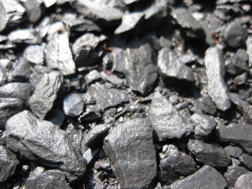
“PANTONE 13-0647 Illuminating is a bright and cheerful yellow sparkling with vivacity, a warming yellow shade imbued with solar power. PANTONE 17-5104 Ultimate Gray is emblematic of solid and dependable elements which are everlasting and provide a firm foundation. The colors of pebbles on the beach and natural elements whose weathered appearance highlights an ability to stand the test of time, Ultimate Gray quietly assures, encouraging feelings of composure, steadiness and resilience.” PANTONE announcing 2021 Color of the Year
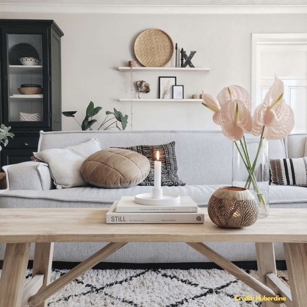
Even though the Color of the Year was announced in December 2020, the nature of the colors selected lend themselves to Springtime decorating! I’ve collected some images that may inspire you to incorporate these colors into your home decor. No need to change your whole design theme, just add these colors as you are inspired! When used as accents, they are harmonious with most palettes. For 2021, PANTONE offers “A marriage of color conveying a message of strength and hopefulness that is both enduring and uplifting.”
Let’s hear it for resilience and power!